A co-created brand with historical roots continues to grow and develop
In 2020, it was time for the robust Pieksämäen Rakennuspuu to be renewed and so the distinguished Pieksäwood brand was born. We had help Janni Valkealahti the brand reform and, even today, we are proud to have chosen the talented Janni for the job.
”Kun Sami Koskinen otti minuun yhteyttä vuonna 2019 Pieksäwoodin brändiuudistuksen tiimoilta, olin heti innoissani ja koin homman omakseni. Nimi- ja omistajauudistuksen myötä oli päivitetty myös strategiaa ja sen myötä haluttiin tuore visuaalinen ilme joka vastaisi paremmin uutta Pieksäwoodia ja auttaisi kommunikoimaan haluttuja viestejä. Ilmettä lähdettiin siis rakentamaan selvittämällä strategia ja halutut tavoitteet brändikommunikaation osalt
As a designer, it is important for me that I believe in the brand and see the potential in it and this was definitely the case with Pieksäwood. The values that are important to me are quality, tradition and authenticity combined with a certain kind of boldness to experiment with something new. I aim to make these values visible in my own business and it was immediately inspiring to see that the same values also guided Pieksäwood’s highly competent team. The long history of operations at the Pieksämäki factory was an inspiring baseline for the design work and I wanted to make this apparent in the look: the goal was that the look communicates quality, elegance and strong traditions in the wood industry and is distinct from the overly technical or ‘engineer-oriented’ feel, which would lack the desired approachability.
“
It was important that the look is recognizable and stylish without gimmicks, just like Pieksäwood’s products.
Traditional forest green was selected in the colours and pink was added as a counterbalance to the brand colours, something which the wood industry has not been accustomed to seeing before. Together, these colours gave us the Pieksäwood palette.
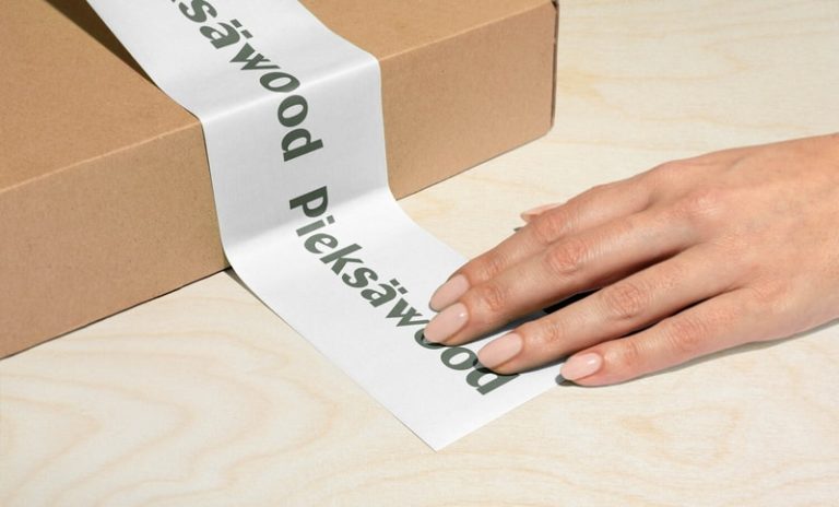
High-quality typography has been applied in the logo so that the whole is peaceful and traditional but, on closer inspection, the letters have personal and distinctive features, which also contribute to the Pieksäwood feel. The font thickness varies and is in some places very thin, which is noticeable, for example, in the forms of the letters e and ä, which bring a fresh breeze into traditional typography. Alternating round and sharp shapes create contrast. The logo is recognisable and works both in large size on signs and in small size on social media posts and it is designed to stand the test of time – just like Pieksäwood’s products.
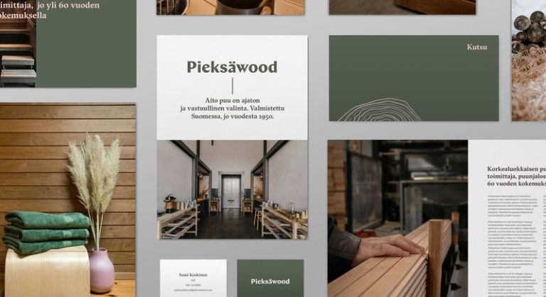
I wanted to bring contrast to Pieksäwood’s typography of visual materials with a serif typeface, which works well with the logo. The selected typography has a similar style as the old traditional typography of Finnish newspapers while certain angles resemble carved wood. Nevertheless, the typeface looks fresh and, once again, we were able to play with a combination of tradition and trendiness.”
“
Overall, the design project was a great success and it has been great to be part of Pieksäwood’s success story and see them grow.